Rethinking recipes
This post was migrated from my old site to a new system that doesn't quite support the same formatting. Sorry if it looks a bit weird!
I think cooking is a scary prospect for a lot of people because it seems so complicated, when 99% of it is really simple. That said, I think it could be simpler.
Recipes are often a nightmare to decipher, especially as you refer back to them during the cooking. They’re published in books that won’t stay open on the counter top, in a tiny font you can’t quickly glance at. I would read through a recipe a few times and mentally plot when I was going to do different things based on how long I thought everything would take – but that seldom worked out as I’d forget under the pressure.
I picked up one of the endless notepads I have lying around my office and started writing out my own recipes, with rough timings and steps that I feel make more sense. Perfect for me, but not so much for the problem on the whole. As a designer with time on his hands and a problem to solve, I decided to try and make my recipes as silky smooth and simple to follow as possible.
Let’s break it down.
Common information a recipe needs to convey
- How long will this meal take to prepare
- How many people will it feed
- How hard is it to prepare
- What ingredients do I need
- What quantities of these ingredients do I need
- What ingredients do I combine
- When & in what order do I combine them
All recipes supply most of this information. I think there’s a couple of things we could add to that list:
It should be easy to read
No tiny font, no huge paragraphs. Simple steps. It should be easy to pick out ingredients in a sentence.
Substitutes for ingredients
Sometimes I can’t find everything a recipe asks for. Can I make a Thai Green curry without bamboo shoots? Sure, it’ll taste similar but probably needs bulking up a bit. Maybe add some chopped bell pepper or baby corn.
Constant context
You should know where in a recipe you are. You should be aware of why you’re doing what you’re doing when you’re doing it. You pre-heat the oven before you do anything because otherwise you’d be waiting for the oven to warm up after preparing the ingredients.
Common mistakes & things to be wary of
If you’re reading a recipe, chances are you haven’t cooked the meal before. If you’re slow at chopping, maybe prepare everything in advance because the stir-fry ingredients come together quickly once you begin. If you’re too slow, you’ll over-cook the pork.
What can I do with leftovers?
Make something else? Freeze them?
Analysing what recipes look like today
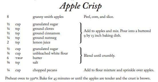
Here are a couple of examples of recipe books in my kitchen. We’ve got about 10, but I’ve tried to pick ones that highlight pros/cons of current books. I’ve also included a common web recipe.
Nigel Slater: Eat
This is a great little cook book. There’s lots of really quick recipes, so they don’t need much explaining – I can’t help but feel that the layout could’ve been done better. Slater gets a pass for not listing how difficult it is to prepare, because the whole book is full of pretty simple recipes. He also gets a pass for not listing how long it takes as all the recipes are supposed to be quick to prepare.
Pros:
- Bold ingredients in the description
Cons
- No real steps, it’s all a big mush of information
- Ingredients list doesn’t list amounts
- Tells me how many people it’ll serve, but it’s buried at the bottom. How useful!
- The bold is a good idea, but I think the font choice & fact that lots of bolded text is used next to eachother negates any readability that may have been gained. I think bolding the quantity is an error, as it’s much easier to scan read a single bolded word vs a sentence.
The Hairy Dieters
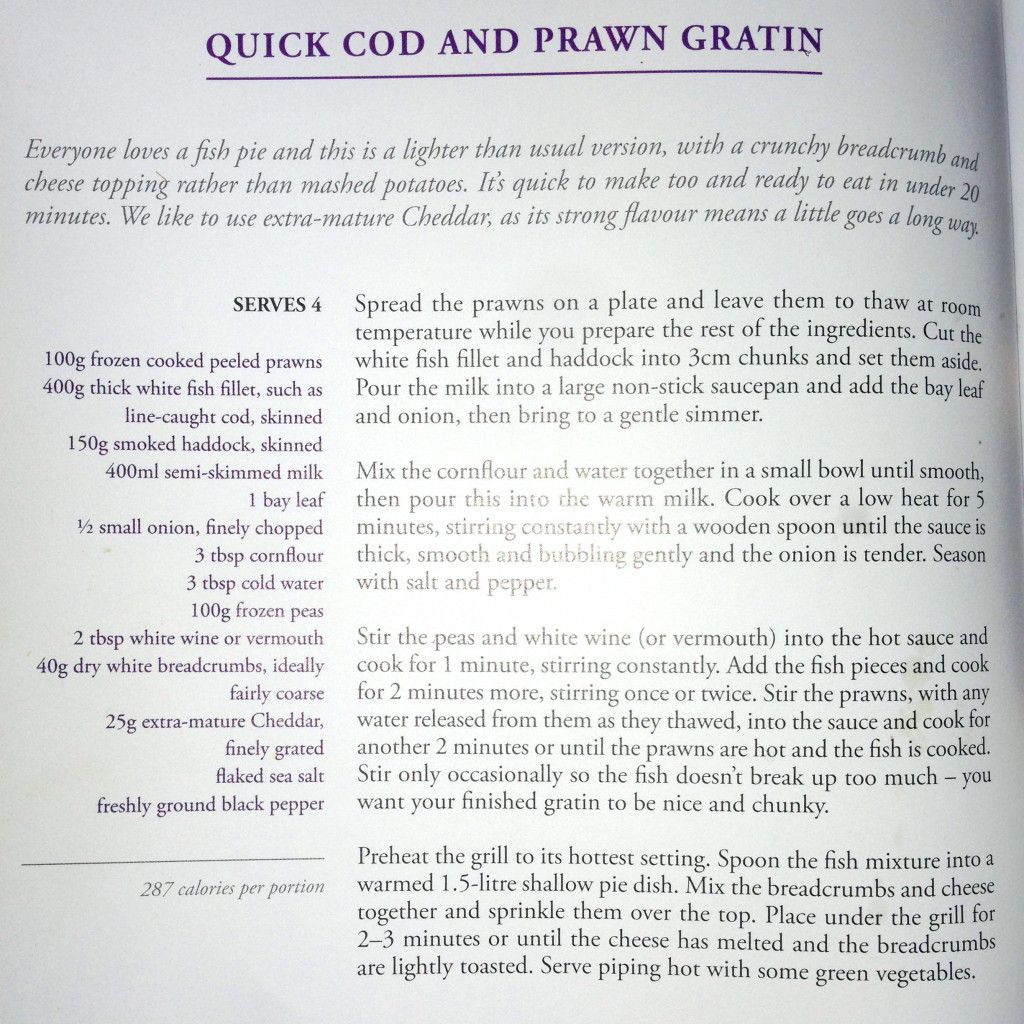
This is my favourite cook book. Everything in here is delicious and especially this recipe for cod & prawn gratin.
Pros:
- Tells me how many it serves
- Tells me how long it takes (though that’s a bit buried in the opening blurb)
- Blurb gives you some rough guidance on things you could do differently. Change the cheese, change the topping etc
- Ingredients are simply laid out
- Though the steps are too long, they are good for giving you context & not overloading you with stuff to do.
- Warns you that stirring too much can cause the fish to break up (warnings & things to be weary of are an aforementioned desirable)
Cons
- Can be quite difficult to find where you are as each step is 5+ lines.
- Difficult to pick out ingredients in the recipe at a glance
Jamie's 30 Minute Meals
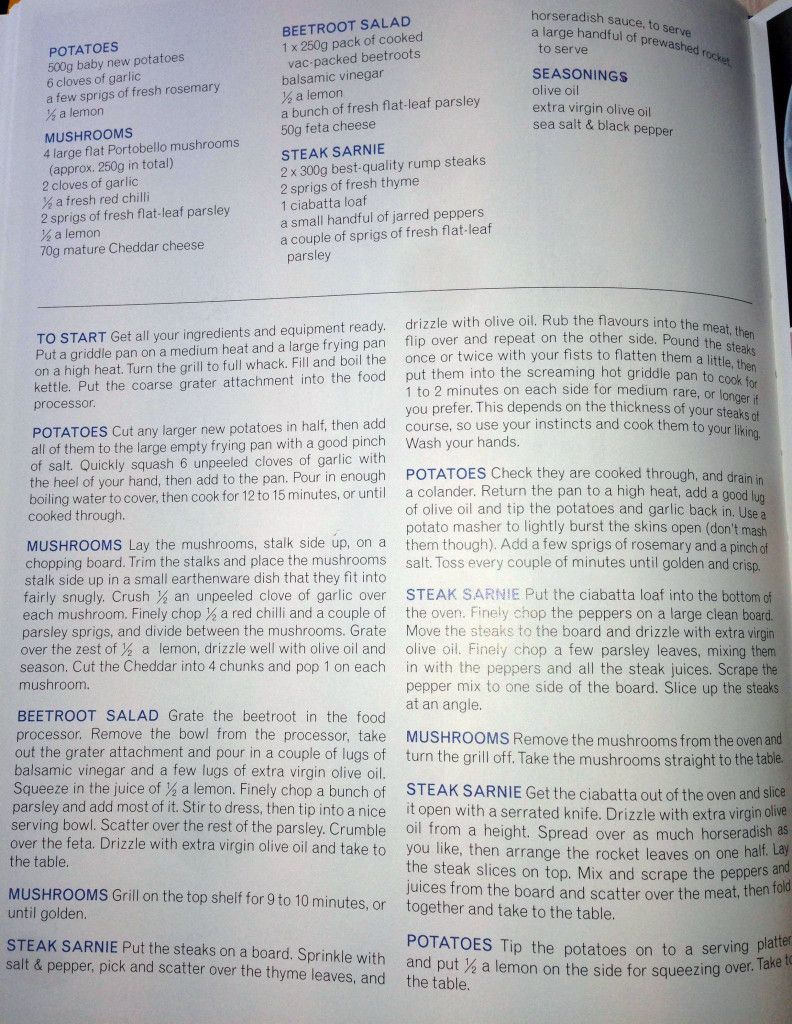
This is my favourite layout by far. Jamie makes it really easy to pick out what step you’re working on and allows you to break out a specific part from the overall recipe (say for example you just wanted to prepare the potatoes) with ease.
Pros:
- Breaks down ingredients really well. He even lists ingredients multiple times for each different combination.
- Steps are all based around a primary ingredient
- I like how Jamie adds real-world steps too. Wash your hands / Take the mushrooms straight to the table
- Pacing and context are good as the steps are properly intertwined & quite easy to decipher.
Cons
- I really love the ingredients layout, but I would like an overall ingredients total too so I don’t have to add them up myself and potentially make a mistake by buying too little of something.
- Some steps are too long, but I can forgive this as they’re well written and put into context by the other steps.
BBC Good Food website
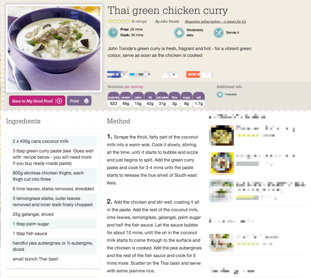
This web layout is always going to be better than print – more colour, more photos, unlimited space. It’ll work well on any device – chances are you don’t have a PC in your kitchen but you’re likely to have an iPad or smartphone.
Pros:
- I like the ingredients layout. Easy to distinguish between ingredients where the text wraps to a new line, unlike The Hairy Bikers where it can be a little confusing.
- One ingredient has a sortof-alternative. However this isn’t representative of BBC Good Food on the whole as there are user submitted recipes as well as professionally written ones, so it’s rather inconsistent. Handful of pea aubergines or 1/2 aubergine, diced
- Prep time, cooking time & servings are right there in the header.
- Nutritional information is great. Not sure how accurate it is though?
- Freezable is a cool (pardon the pun) addition. What can you do with leftovers? Freeze them.
Cons
- There’s unlimited space and yet everything is jammed into 2 paragraphs
- When do I start the rice?
- Difficulty is listed as “moderately easy”. I don’t like this – it’s a bit vague. Easy compared to what? Chicken galantine or microwaving baked beans? Consider that Good Food is written by a bunch of different people and user submissions. Moderately easy for whom?
Ideas for improvement
Below I explore some existing methods that I might like to integrate into mine.
Gannt Charts
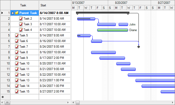
A Gantt chat plots time along the x axis and tasks along the y axis. Each task gets a period of time during which you expect it to be completed. Multiple tasks can occupy the same timeframe, because multiple things can be done at once.
Casey Neistat uses a modified Gantt chart in this video where he’s preparing Thanksgiving Dinner. He takes planning to a whole new level, with his “timing triangle of success” taking into account oven space, burner space & ability to multi-task in order to prepare all the food with optimum efficiency. Casey is preparing multiple different recipes, so it doesn’t really apply to us – but it’s still awesome. I’m inspired.
Pros:
- Really easy to glance at and be aware of what needs doing & when
- Good context for each step in relation to other steps
- Good overview of how difficult a recipe is given its steps are all laid out
Cons
- Doesn’t stand alone. Still needs a list of steps to explain the process
- Chart is cramped – you can’t put this list of steps right next to its time allocation
- Complex recipes are going to be really wide
Infographics
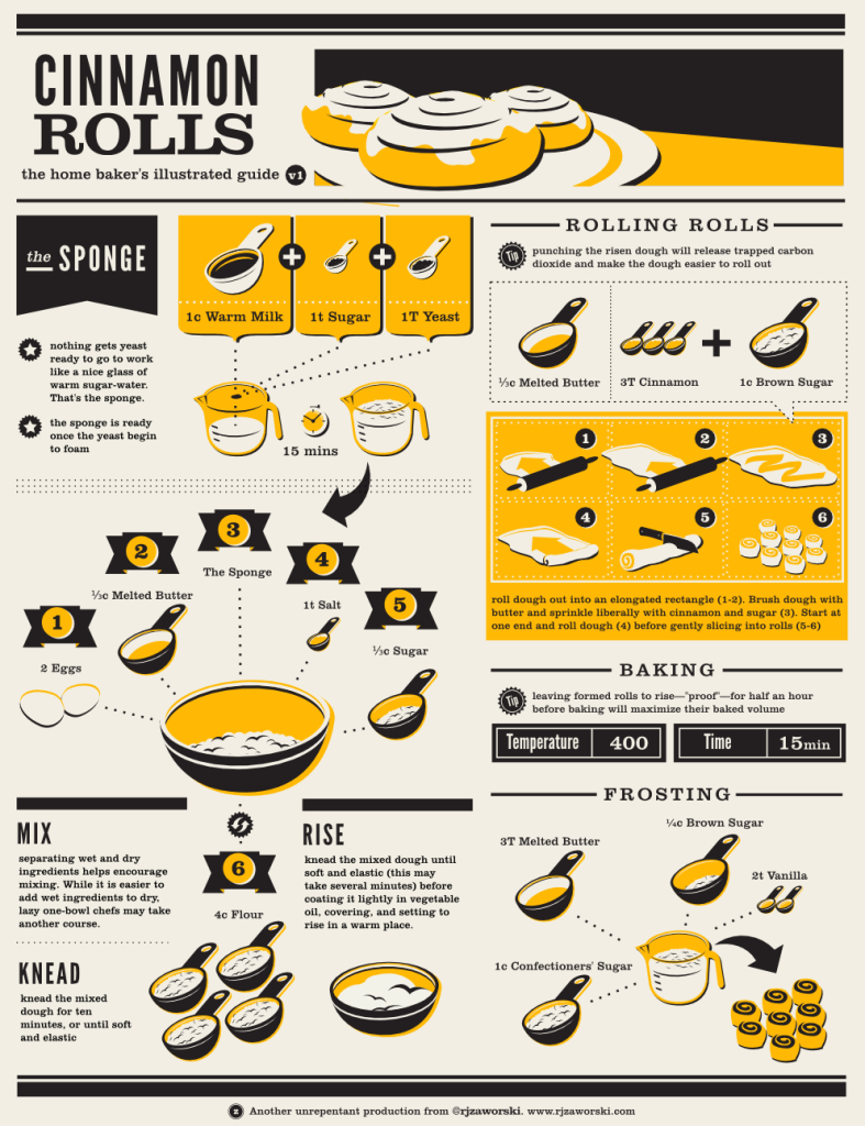
There are a bunch of really cool infographics out there that do a great job of explaining a recipe. However they’re not very repeatable and a lot of work goes into them. Each recipe would need different artwork, and more distruptively a new layout – a reader shouldn’t have to get used to a new layout every time they try a new recipe.
Pros:
- I really like how ingredients surround a container and make it obvious what’s happening. The visual nature of the infographic means you can jump back to it and find your place really easily.
- I like the tips
- I like the big cooking time/temperature section
- I like the measurement size icons, though I think they can be improved upon
- Gives you a good estimation of how difficult it will be to produce
Cons
- A little confusing to follow. Would be good if the dotted lines drew your eyes from section to section also.
- Expensive and time consuming to produce, not everybody could produce one.
- Doesn’t repeat well, new layout, colour scheme and artwork for each recipe.
- Doesn’t allow you to see what can be done simultaneously
Modified Traditional
RecipeDesignWizard is a plugin for Adobe Illustrator that allows you to create this layout for your recipes.
Pros:
- Really like the ingredient list
- Quantity, metric and ingredient are slightly separated and easier to scan.
- Ingredients are grouped.
- I like that each “step” seems like a checklist. Sugar check > next line > cloves check > so on & so on.
Cons
- Wouldn’t work well for anything more complicated than this
Refining my own design
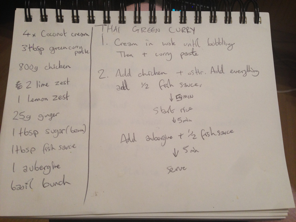
My initial scribbles in a notepad. They’re super condensed because for the most part, I just need roughly reminding, vs explaining the whole recipe. You can begin to see the makings of my timing chart however.
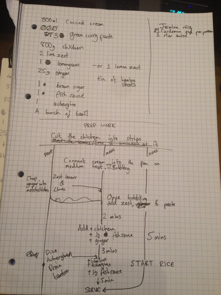
Refining the idea now that I’ve decided to actually work on it/have done some research/know my goals. I’ve decided to cut the process into 3 basic timelines; Prep, Main and Sides. I think these best represent most recipes. I had a line to draw the eye for each timeline and various timings. I think it’s a bit confusing, but as a means to an end in terms of refining the idea, I think it’s worth showing you.
The first iteration
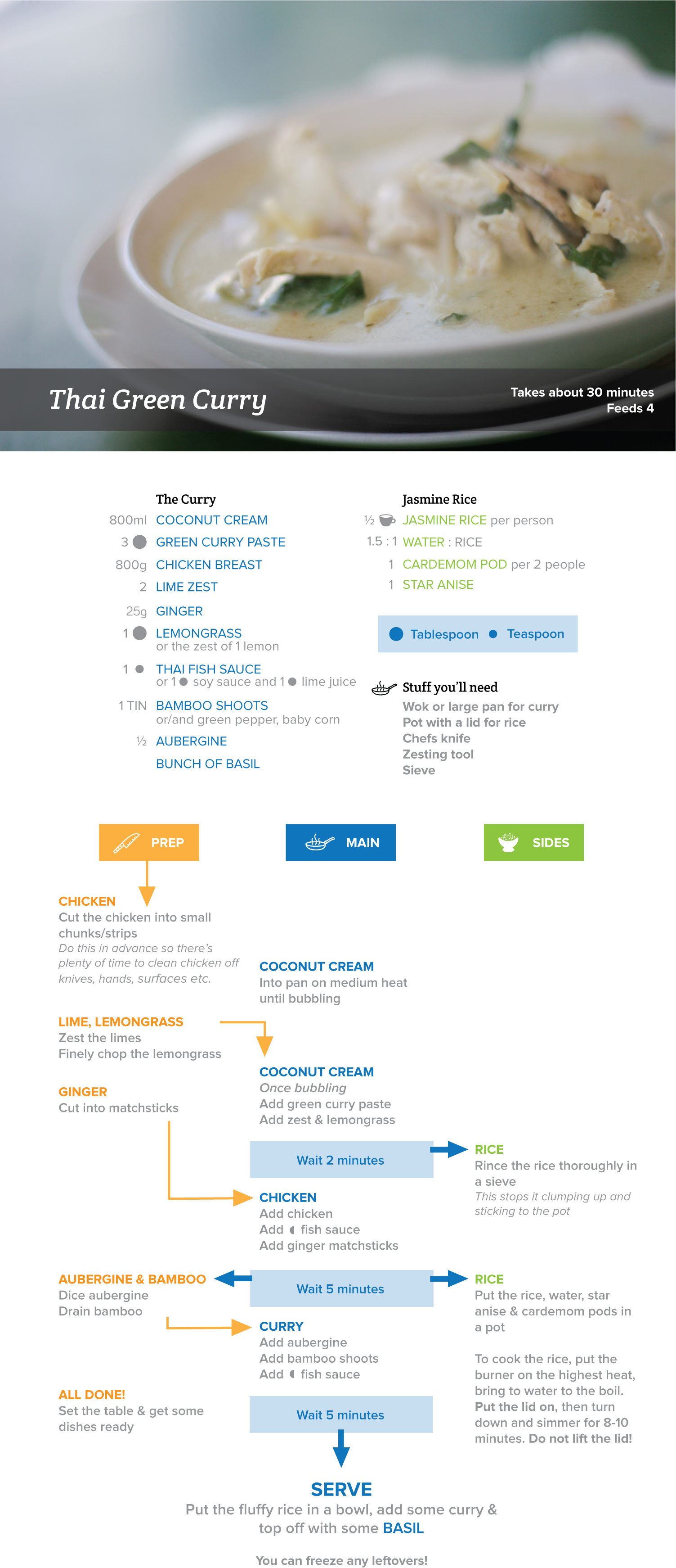
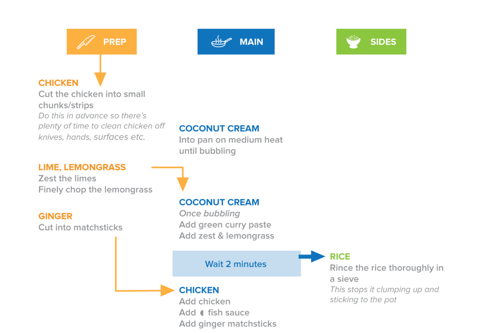
Overall
- I picked Thai Green Curry because it’s my favourite thing to cook. I make the paste from scratch, but I’ve not included that in this recipe because it basically amounts to “put all this stuff in a blender”.
- Time & serving info is right there in the header. Added an image that I found here (thanks TastingMenu.com) because after all, a recipe is supposed to capture your imagination.
- It’s easy to get an estimation of how difficult the recipe will be by taking a quick look at the steps. It could be argued that this is true for all the recipes, but I think these instructions have a certain glanceability about them.
- I decided on using different colours to help differentiate what’s happening in what column. Note continuity from ingredients to instructions with regard to the Sides. That way, if the user making the recipe is going to use microwave rice (heathens) for example, they know what to disregard when purchasing ingredients.
- I tried to design it in a way that would allow it to be split into 2 sides of an A4 piece of paper. I could split the ingredients & instructions, print and laminate it and leave it in my kitchen cupboard. Also, an iPad aspect ratio is similar to an A4 piece of paper so chances are the different sections would fit on it properly.
- I didn’t make a complex layout, there are 3 columns. This is something an app or website could make it easy for a user to replicate (unlike an infographic style recipe).
Ingredients
- I gave ingredients a colour to allow readers to differentiate between main recipe ingredients & side dishes more easily.
- I created a shorthand for Tablespoon and Teaspoon, and assigned “cup” (a common measurement) an icon. I did this to establish it as a shorthand so I could use it in the instructions, where I’m trying to be as concise as possible, too.
- I separated the the name of the ingredient from the amount required similarly to the RecipeDesignWizard.
- Unusual ingredients have substitutes
Instructions
- Took a leaf from Jamie Olivers book in giving each step a header of the ingredients being used.
- I dropped the lines for each section from my initial design, as when I mocked it up properly they were far too confusing.
- Each step is written sequentially, as if each line were part of a checklist.
- Common kitchen tasks are included – prepping chicken in advance so you have plenty of time to clean it up & not be potentially spreading raw chicken around your kitchen rushing to do other things.
- I added short tips and some explanations.
- I added wait blocks so people know that they’re going to have nothing to do with the main, and should do whatever needs doing with Prep or Sides.
- What to do with leftovers is written at the bottom, post serving.
What Next?
Who knows! I’d like to do a whole collection of these, or maybe work on a site to allow their creation. I posted this to Reddit and got lots of good feedback, which I'd like to incorporate into a refined version.
Got some feedback? Drop me an email lloyd@lloydhumphreys.com