Sketch symbol best practices (now that nested overrides are a thing)
This post was originally shared on Medium and re-posted here. (I am the author)
At Tradeshift, we’re beginning to maintain a central Sketch document with all our symbols. In order to be added to this document, a symbol needs to be of a certain quality. Everyone designing for us (and potentially our partners) will make use of this document, so we don’t want to be distributing anything but the most solid symbols.
Symbols should behave in similar ways, be small enough to be modular, be large enough to be useful, and be organised well for easy editing (or embedding in a document when detached).
Nobody likes to inherit a poorly organised Sketch file, so let’s not distribute poorly organised symbols.
Create the most basic component you can
Ideally, you shouldn’t be detaching Symbols often, because that defeats the purpose. Create the most basic version of a component, individual Symbols that you can combine later to create a more maintainable whole. You can make changes more confidently if the symbol changes you’re making changes with a smaller scope.
Nested symbols make this a bit more of a nuanced affair, but use your common sense and you’ll create powerful, maintainable symbols.
Naming your symbols
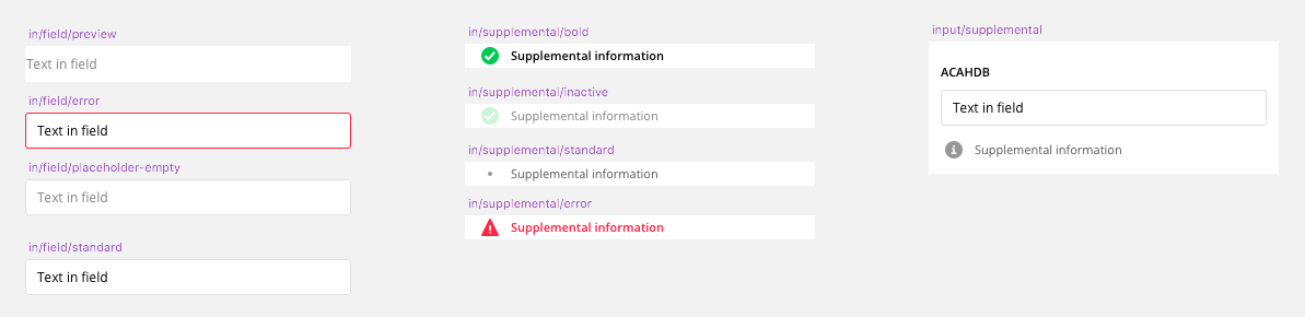
Name your layers appropriately. We try and stick to all lower case, separated by dashes.
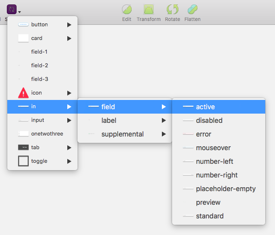
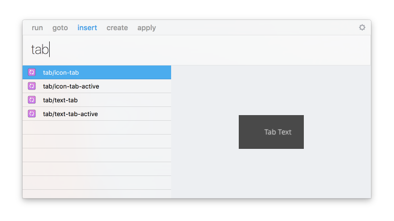
Sketch automatically organises Symbols into folders when you put a / in the name:
I recommend a control/definingproperty-state naming convention. Default states shouldn’t have a state — tab-inactive and tab-active is redundant. tab, tab-active is the way to go. Your names shouldn’t be too tightly tied to a controls physical attributes, since they’re likely to evolve.
- button/primary-mouseover
- button/primary-disabled
- in/input/field/active
Denote nested symbol dependencies
I also recommend using your naming convention to denote dependencies now that nested symbols are a thing. When you’re copying symbols between documents, it’s good to know that you need to copy all the symbols with the prefix in/ for input fields to behave as you expect. It also keeps your insert symbol panel tidy.
Organised symbols make your life easier
When using Sketch Runner, establishing a naming convention means you’ll always be able to find what you’re looking for because there’s a pattern to what you’re searching for.
Naming your layers
Give the layers themselves appropriate and consistent names. Backgrounds should always be called background and not mixed up with bg for example. If you detach the Symbol, it should remain a tidy and self-contained object.
Text is especially important. Ensure that nested symbols you’ll regularly replace (i.e. for different states) have the same text layer names. If you replace a symbol, it will persist any override text if it shares the same text layer name.
You can rename instances of symbols and it won’t affect the link to the original. As such, I’ve taken to naming instances of symbols with lower case text, and text that they edit as all caps. This is just a matter of preference.
Layer hierarchy
Put any editable text on top of your groups as a rule. Then when you hit return twice to expand a group, you’re immediately editing text!
Symbols will be reused, detached and remixed — they should be really well organised, so anyone can quickly understand what’s going on when they look under the hood.
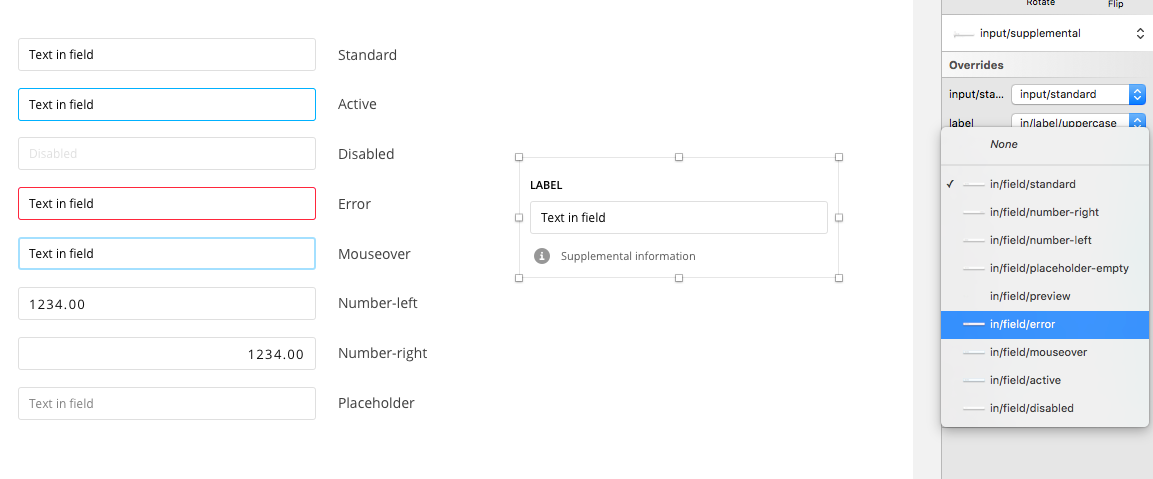
Your layer hierarchy is reflected in the overrides panel. If your parent symbol has nested symbols which would be edited in a logical order, make sure the overrides panel reflects that.
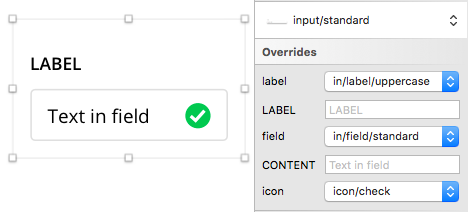
Using nested symbols in the override panel
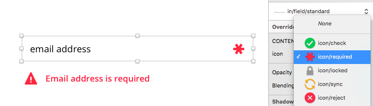
Symbols which are the same dimensions will be available in the overrides panel as a replacement option. This is especially useful for icons:
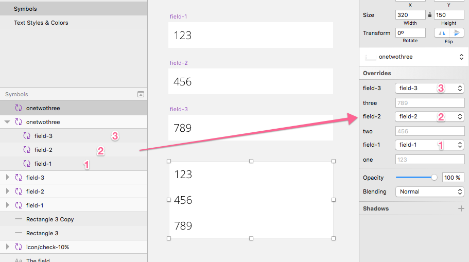
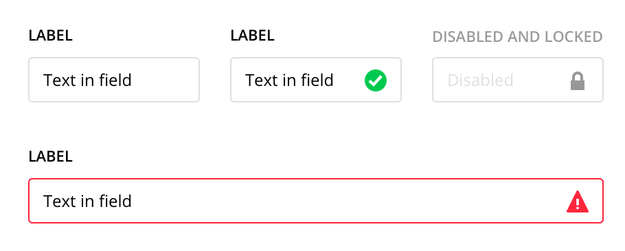
It’s really powerful for changing states, too:
By using nested symbols, you can create super flexible controls that mimic their possible states in any UI library you might be using (like our UI Component library at Tradeshift).
These are all the same symbol:
Bulletproof resizing
If you distribute symbols that break when you resize them, you’ve already lost the war. Someone unfamiliar with the inner workings of symbols will Detach From Symbol faster than you can blink and all your work was for nothing.
Play with them, test them, try to break them. Build something bulletproof! An extra few minutes of your time to perfect the symbol will save headaches down the road and make everyone who has to use and maintain your symbols happy.
Check out Peter Nowell’s Resize Cheat Sheet
Miscellaneous tips
Text should be fixed
Text should be fixed, and aligned correctly, so that when you resize a symbol it maintains its position & padding properly. Text should have a “Resize Object” resizing property. This breaks trailing layer resize adjustment, but I can never get that to work reliably anyways.
Placeholder text is an opportunity to reinforce best practices
For example, our placeholder text content (not the layer name) is “ACTION INTENT” as a passive reminder of how a button’s microcopy should be phrased.
Design the smallest version of a symbol
It’s easier to design around stretching Symbols than compressing them.
Replacing symbols
Sketch will replace one symbol with another, and compress/stretch the symbol to fit into the same dimensions. If you replace symbols with mismatched dimensions, you can use right-click-> Set to Original Size to fix it.
Use alt+enter to insert a line break on nested text objects
Multi-line support for text, boom!
Lock nested symbols to prevent them from appearing in the overrides panel
By locking nested symbols on the symbols original artboard, they no longer appear as an override in the inspector. Thanks to Matt Healy!
Symbols should be self-explanatory to use
However, it doesn’t hurt to provide some background on the more complex ones — especially if your team isn’t that familiar with them.
Example files
In the comments, I’ve been asked for an example file. It’s not something I can give away just yet, but UX Power Tools have done a great job! Check it out.